|
|
Enter subhead content here
|
|
So how did the original 1991-1992 World League get such new and futuristic looking
designs for their teams? The answer is... Dave Boss.
Learn more about Dave Boss here: http://company.uspresswire.com/davidboss.aspx
High Designs for a New League by
Richard Keller The project officially began in November 1989. "We met in Dallas
to talk about names and other things. Then we met again in April to review everything we had been doing," Boss said.
"We invited people from the NFL Properties office in London to offer a European viewpoint. We brought in the licensing
people from New York. Together, we sat down and began trying to solidify a list of names to work with."
That
proved a complicated proccess in itself. "There was no criteria other than wanting names that were contemporary and
didn't go back to the traditional names of animals and the like. For the European teams, we sought names that related to
the history and culture of their city," Boss described. "we had to run all names through legal search to make sure
they cleared in licensing categories for apparel, games and toys and other promotions and products."
The final
name selection -- The San Antonio Riders -- was not finished until late December [1990]. "We had been looking at a lot
of names down there. At one point, they were going to be 'The Alamo'. Another time, it was the 'Lone Stars'. Then it went
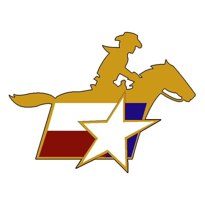
to 'Trail Riders' and finally to 'Riders'," Boss said. "Owner Larry Benson wanted a concept that was unmistakably
Texas. So we designed a logo with a stylized version of the Texas flag and accompanied it with a silhouette of a horseman,
which we had deveolped for Sacramento when they were to be called the 'Pioneers'. The colors of chocolate brown and gold
make it a very pretty uniform."
From the start, Boss was limited by the colors available to him. "I
went into this thing hoping we could create colors people had never seen football players wear before. I wanted to try candy
apple metallic paint on some of the helmets to give the appearence you see on some automobiles. But Wilson, who manufactures
the uniforms, and Ridell, the helmet people, only wanted to work with the standard colors, given the time constraints. That
meant we had to take those basic colors and use them in new and distinctive ways."
Serious design work began
in May, when the first tame names gained clearance. The case of the Barcelona Dragons was typical of the evolution. "They
wanted the name 'Dragons from the very beginning, but we went through many dragon designs before the final version was chosen.
It was designed by Los Angeles artist Jayme Odgers, who paints with a strong influence of Picasso in his work. He drew me
27 dragons, ranging from the traditional to cartoon. The final version has that Picassoesque touch. Meanwhile, we had royal
blue, gold, and red as the color combination, but they insisted on green since that's the color of a dragon. I relented,
because they've seen a dragon and I haven't."
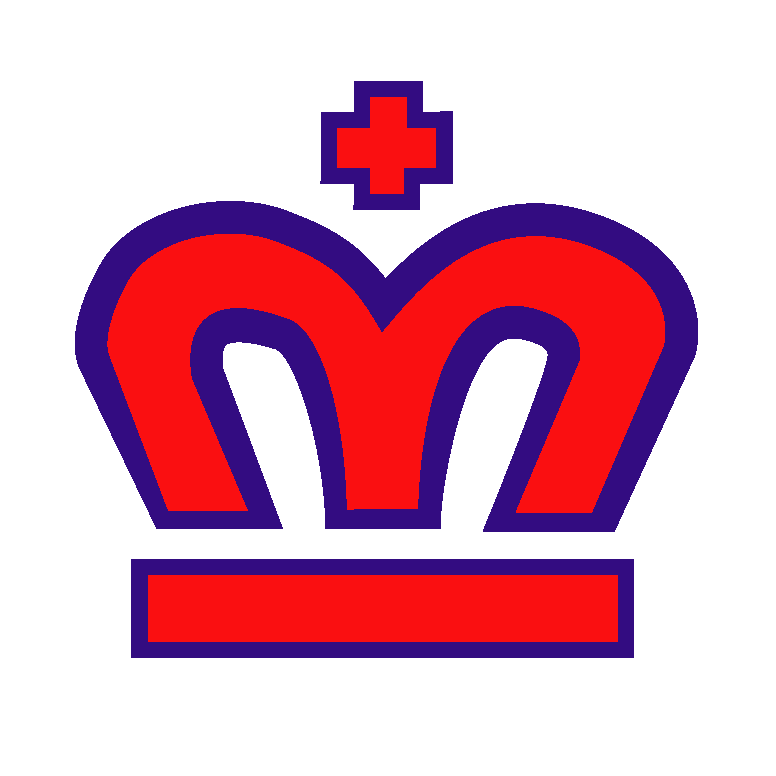
The London Monarchs proved a simpler case. "We wanted
to give a sense of tradition to London. That's why we chose a monogram "M" for 'Monarch' and made it in the shape
of a crown. We did the uniform in royal blue with a touch of red to somewhat reflect the Union Jack, supported by a gold
helmet and pants to represent royalty. Overall, it made a fine looking uniform, and I know the people in London are very,
very happy with it."
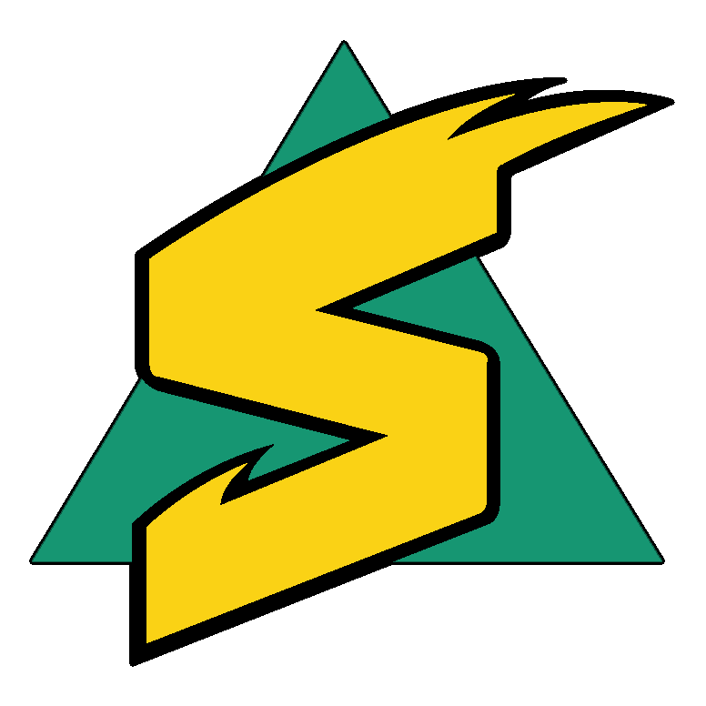
"The Sacramento Surge was an interesting case. [NFL head of Marketing] Bob Sloane
backed the 'Surge' as the name because it represented the computer industry in Northern California. An electronic surge.
I also thought of the Sacramento River and its surging water. We took the triangle, the delta shape because Sacramento is
a delta area, and placed an electronic surging "S" on it. Aqua and gold work very well for the California colors.
I like it a lot, it's very simple and direct."
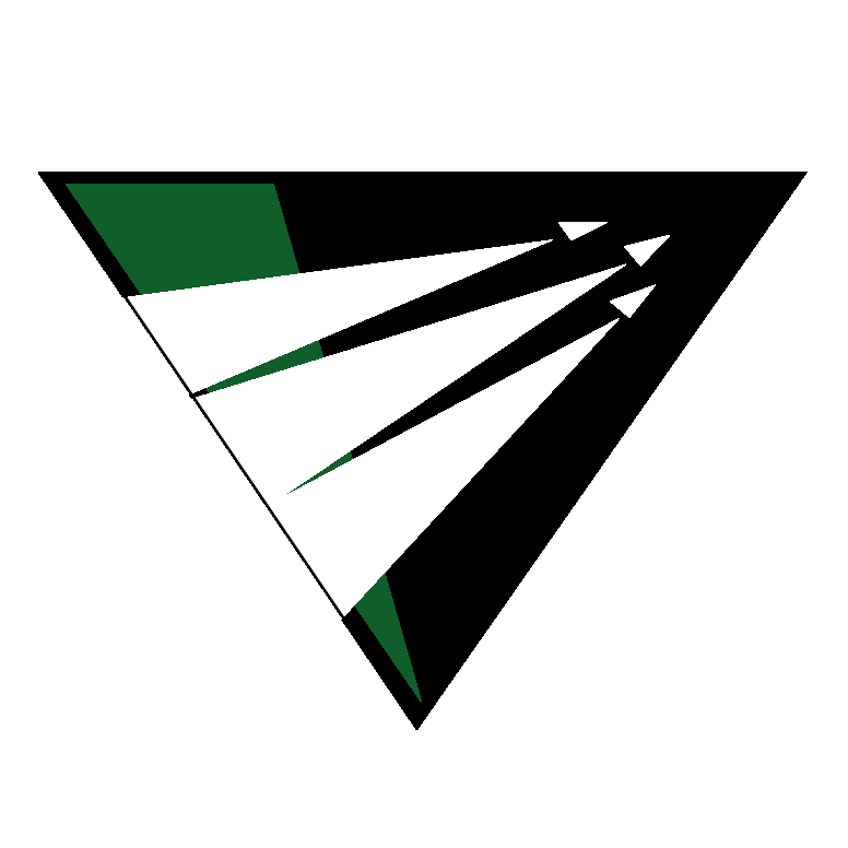
Design decisions for Raleigh-Durham were similarly straightforward.
"They wanted red uniforms," said Boss. "We worked with a lot of different names before we finally settled
on 'Skyhawks'. The idea was to come up with something futuristic that represented powered flight, of which the Carolinas
are the birthplace. We wanted to come up with something unexpected, so instead of a bird, we went with rocket trails."
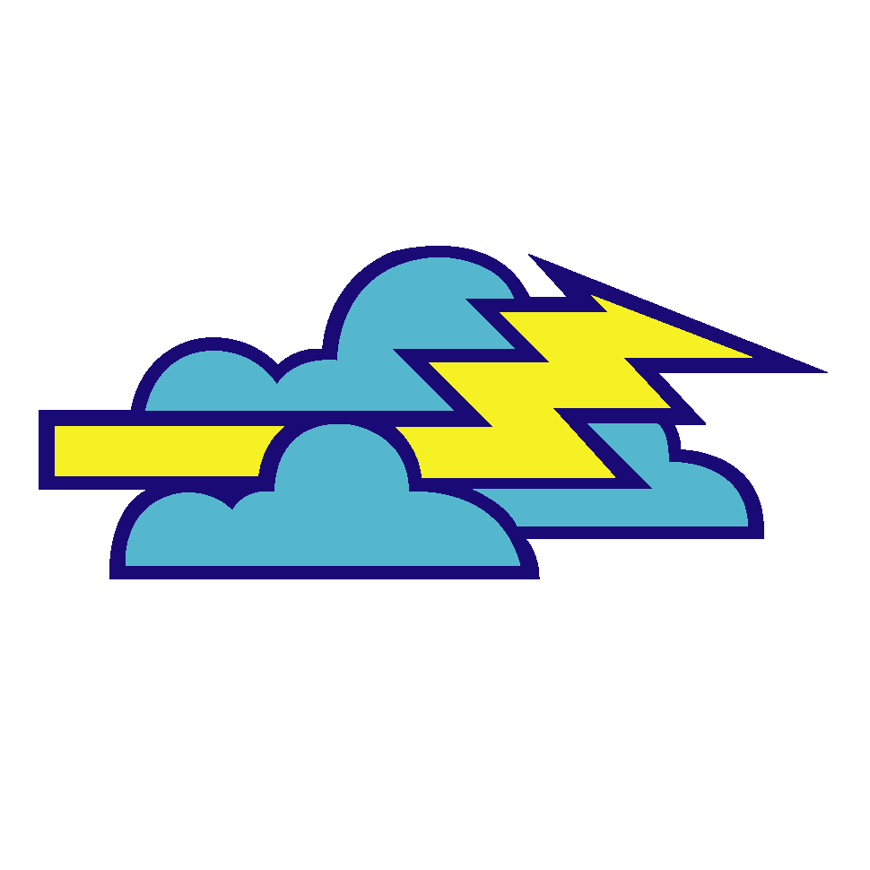
The Orlando Thunder was another relatively easy scheme to produce. "We had that one nailed down real fast,"
Boss said. "We got the name cleared early. The name 'Thunder' produced six early designs, any one of which would have
been successful. That was the one concession by Wilson to use a fabric they did not have, a fluoresent lime green. It's
the one jersey that's different than anything else in pro football."
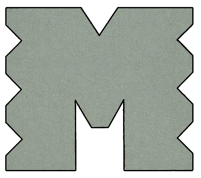
Montréal's format was an idea
waiting to be applied. Said Boss, "Paul Biederman, art director for the creative services group in our New York office,
came up with that concept. THe idea was to use an 'M' as iff it were created by a large stamping press to project that feeling
of a big, powerful entity. We tried a lot of variations on the letter, and this one was the most successful over the long
haul. We colored it machine gray and placed it on a burgundy background to make it stand out."
In Birmingham,
Boss stated, "The fire image was one that everybody liked. I decided one day driving into work that we should put the
flame on the sleeves and helmet. Everybody liked it immediately. We picked up the navy for Auburn and the Crimson for Alabama
and combined it in a way that was an entirely different color combination. It makes a very strong uniform symbol.
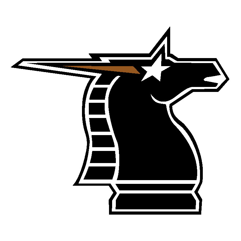
The decision process for the New York/New Jersey Knights was a study in contrasts. According to Boss, "The people
in New York told me early on that they wanted black and silver. For the name, they quickly chose 'Knights'. I wanted to
get away from the swords and shields, the classic knight symbols. We tried some things with the New York skyline and art
deco approches to capture the sense of New York at night. Then it occured to me that a knight is also a critical chess piece.
So why not take that symbol of a horse and give it a modern twist with a starburst in the eye."
In the end,
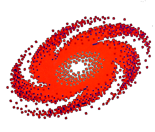
the evolution of the Frankfurt Galaxy design became a microchasm of the entire undertaking. "Galaxy was always the name
for Frankfurt, althought it went through many, many changes before we ended up with what we have. We worked with a purple
background, with burnt orange and crimson as supporting colors. One day, I picked up the Los Angeles Times and on the front
page was a full-color reproduction of a photograph taken by a new telescope of a heretofore unknown galaxy. It was a kind
of spiral nebula, a beautiful shape in the sky. We took that image, put it into a computer and applied the printout to our
design."
Aside from the inevitable sublte adjustments to the basic form, the weighty project of giving graphic
life to the World League was completed three months before opening kickoff. Already Boss was convinced that the results more
than justified the expended energy.
"I relly feel it was a success", he concluded. "The feedback
I'm getting is very, very good. Every team has embraced their logo and colors with enthusiasm. Everyone thinks theirs is
the best of the bunch". Taken from Gametime Magazine April 6, 1991 (Opening Home Game)
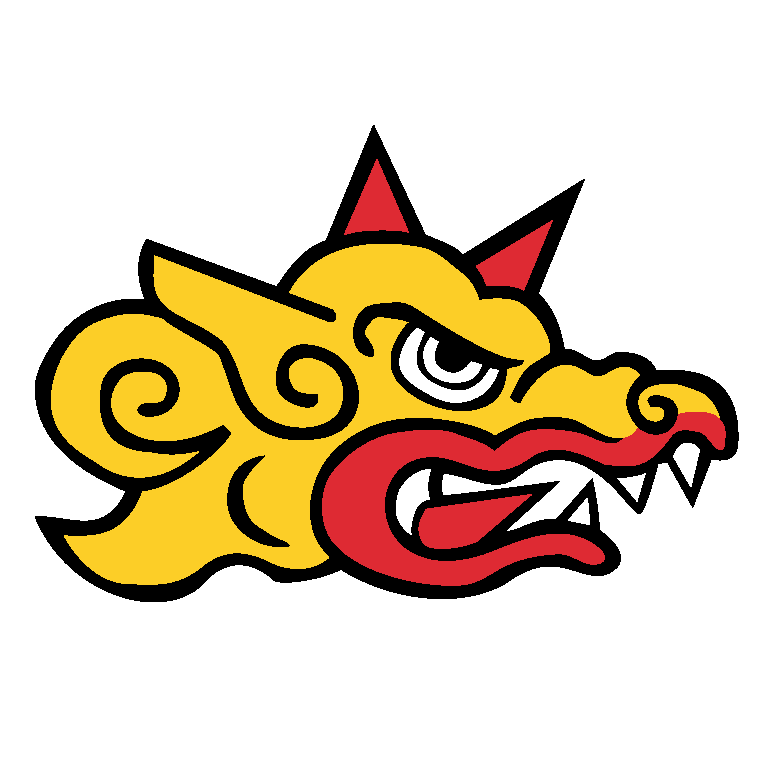 Barcelona Dragons Colors: Dark Green, Red, Light
Gold, Black
Birmingham Fire Colors: Navy,
Light Gold, Red (Crimson)
Frankfurt Galaxy Colors: Purple, Burnt Orange,
Red
London Monarchs Colors: Red, Metallic Gold (or
Vegas Gold), Royal Blue
Montreal Machine Colors: Maroon, Navy, Metallic
Silver (or Gray), Red
New York / New Jersey Knights Colors: Black,
Metallic Silver (or Gray), Metallic Gold (or Old Gold)
Ohio Glory Colors: Red, Blue
Orlando Thunder Colors: Royal, Columbia Blue,
Yellow
Raleigh-Durham Skyhawks Colors: Red, Kelly,
Black
Sacramento Surge Colors: Aqua, Light Gold, Black
San Antonio Riders Colors: Brown, Metallic Gold
(or Vegas Gold), Red, Blue
1995-2007 New League, New Designs Amsterdam Admirals
Berlin Thunder
Cologne Centurions
England Monarchs
Hamburg Sea Devils
Rhein Fire
Scottish Claymores
|
|